


Interview part 2 – Expression
Course subject(s)
5. Style & Expression
In this second part of the video Mark van Huystee discusses his ideas on finding the right expression in a drawing. He shows how precise his work is and how you can use, what he calls, “quality by quantity” to become the best expression in your images. In his opinion you will find the best design after making several draft designs.
Sorry but there don't seem to be any downloads..
Subtitles (captions) in other languages than provided can be viewed at YouTube. Select your language in the CC-button of YouTube.
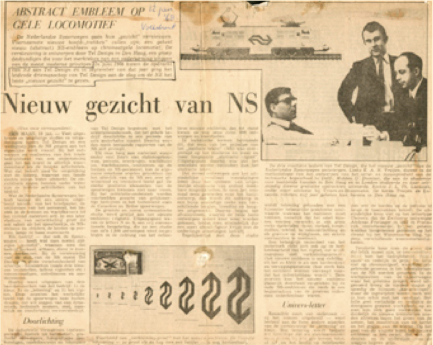
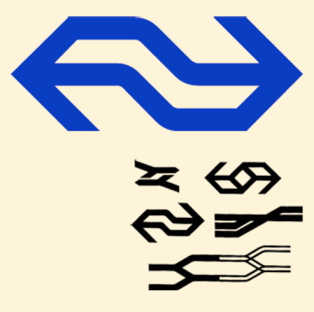
Optimised expression of a company logo
Here you can see two pictures from a design process for the Dutch railways (NS). The logo was formed from two arrows in opposite direction. The lines indicate the train tracks. The design, from 1968, is by Gert Dumbar and René van Raalte.
After the initial idea, a long process took place in order to optimize the expression of the logo. Many different dimensions, colours and line thicknesses were tested amongst a group of reviewers.
The designers found out that by changing a small detail in the dimensions, they could change the associations with the logo, form a ‘hip’ to a very slow and dull trademark. Also when the curves were too bended, it gave the impression that the trains could spin out of the rail tracks.
Pictures and story from: Emile Truijen, brieven van een designer: een autobiografie, by Emile Truijen, N.F.M. Roozenburg, 1993.

Image|Ability - Visualising the unimaginable by TU Delft OpenCourseWare is licensed under a Creative Commons Attribution-NonCommercial-ShareAlike 4.0 International License.
Based on a work at https://ocw.tudelft.nl/courses/image-ability-visualizing-unimaginable/.