4.2.1 Detailing
Course subject(s)
Module 4 – Scale and Context
As a child or later on, you might have come across the animation series about Barbapapa and his family. One of the creators of Barbapapa is Annette Tison, a French architect and writer. The house of Barbapapa has remarkable details. The clarity and attention to detail is typical of an architect’s drawing. In section views, such as this and this one, you can clearly see the spaces through the details formed by showing the essential outlines.

When you start detailing as an architect, you can also start by drawing the essential outline of interior spaces and the profile of the roof and facades. Later on, you can add in the openings. In section view, you can give the walls and floors enough thickness to accommodate for the technical features, such as constructive support, thermal insulation, and so on. Such sections also need to be fine-tuned to allow people to live comfortably; to put in their own furniture, to move around, to cook, to dance etc. The dimensions should be optimal for all ergonomic requirements.
Architectural decisions have to be taken in line with your guiding theme. Many options are available, so when you design the roof and facade details, we recommend that you make simple design choices along with clearly sketched details.
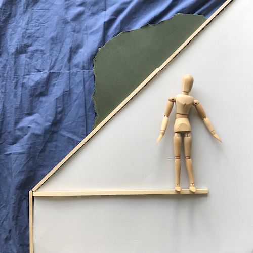
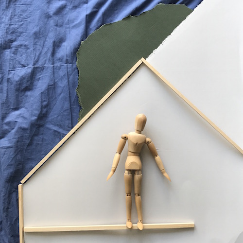
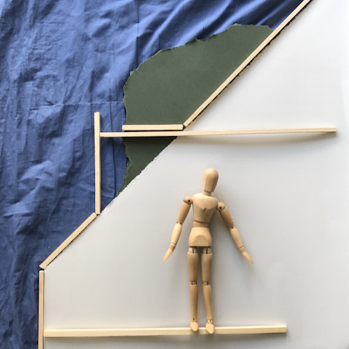
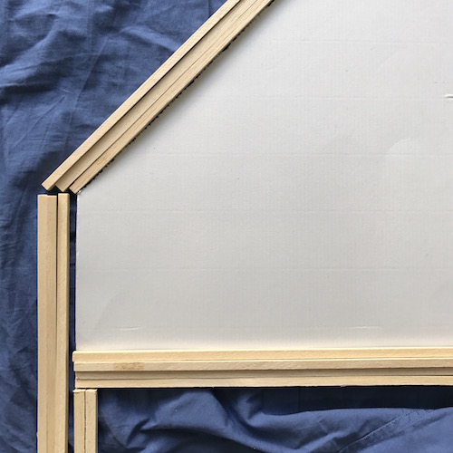
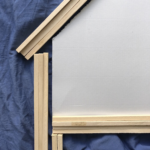
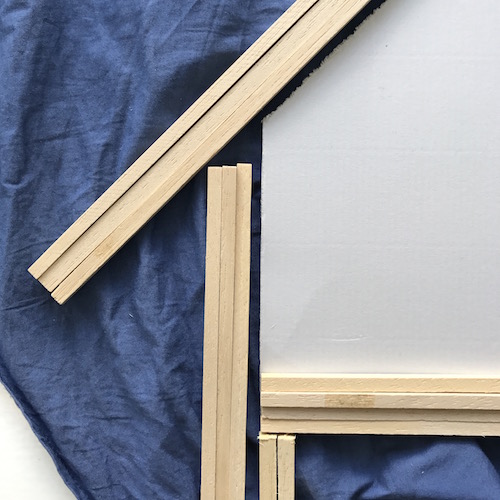
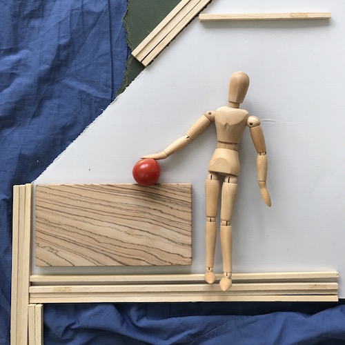
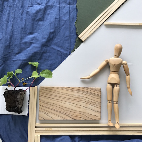
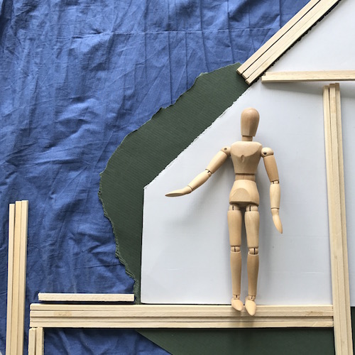
If you study the 9 pictures above, you will notice many kinds of considerations and decisions of the model-making process. By playing with the sticks you get instant ideas and dimensions can be edited very quickly. Compared with drawing, this type of ‘object oriented’ sketching is quick, although it requires preparation by collecting a set of materials that suit your exploration wishes.
Such sketches don’t come easily. Although they are playful, they are developed with full concentration, in an intense flow, with a constant critical rigour and, perhaps, opportunistic mindset. One cannot do this type of work constantly or on demand, especially when you are not yet used to it. You have to prepare for it not only with the materials you will need, but also by finding a suitable place where you can concentrate without the distraction of social media and the fear of not doing it right. Making mistakes, getting annoyed, stopping and getting back to it, is all part of the design process.
There is a funny, but serious YouTube lecture by John Cleese, who talks about the conditions for creativity. His advice might be helpful in your explorations. This video is a bit outdated and long, so don’t feel obliged to watch it all the way through.
Below you will find our 3D photogrammetry model that was shown by Sanne in this week’s introductory video. You see how the different material palettes for the floor, brick facade and roof come together. On the interior of the model, you will witness that we also had some problems with the photogrammetry, which left big white surfaces and strange holes. In seeing this we learnt that big surfaces of the object you wish to scan which have one single colour may also need some dotted texture to let the photogrammetry software grasp what is actually there.
https://skfb.ly/6MsNP

Models in Architecture by TU Delft OpenCourseWare is licensed under a Creative Commons Attribution-NonCommercial-ShareAlike 4.0 International License.
Based on a work at https://ocw.tudelft.nl/courses/models-architecture-design-physical-digital-models/.


