


Ways to distinguish elements in a complex situation
Course subject(s)
4. Unraveling Complexity
Let’s start with knots in shoelaces. Knots can be seen as a complex ‘situation’ because several laces or two ends of the same lace ‘interact’ with each other. In a drawing the two ends of the shoelace can be given a distinct color in order to show how the knot is tied.
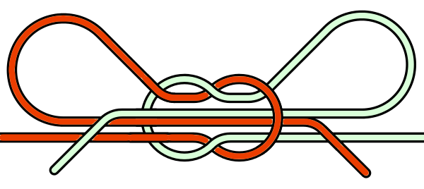
Colors are frequently used in complex drawings to distinguish different aspects. In images that explain the knots in shoelaces for example, it does not matter much what two colors you use. It just needs no further explanation. Colors in maps on the other hand often need a legend to indicate what each color means.
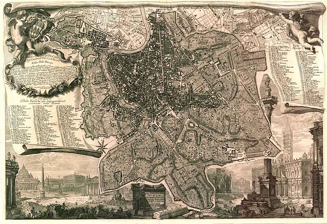
A famous example of a map is the one below by Giambattista Nolli (whom you already know because Gallery 2 of our Museum is in his honor). The Nolli map from 1748 shows Rome in a very clear way. The map is in black and white, with a very clear meaning: white indicates urban public space, while black indicates built area and private space.
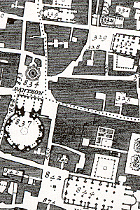 Detail of the Nolli map with the Pantheon.
Color and ink are used to represent certain things in a drawing, while the details are left out. Nolli could have drawn every single house in the city and he could have indicated different sorts of space in the city, but he made the decision to unify all differences into the most important two: buildings and public space. By doing this, Nolli left the complexity of Rome intact, but he turned it into a clear map that is still recognized as a masterpiece in cartography.
Here is another example of a map using color, drawn by a member of our course team, Jitske. It shows how different means of transport are mixed in the streets of Delft.
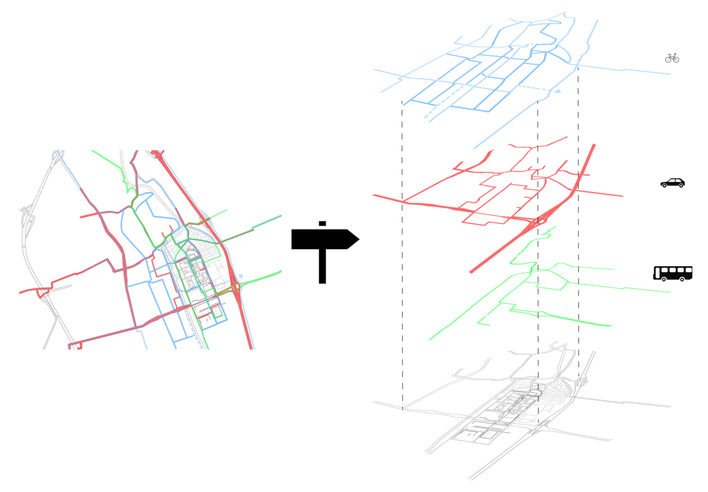
Because of the many students that do not drive cars, we have a dense network of bicycle lanes and public transport (buses and a tram). The drawing indicates the separate networks and the combined image. With a closer look at such a system of superimposed networks, an urban designer can locate places where the different sorts of transportation collide. Those places often need extra care by designing transportation hubs, borders and connections.
One more example. Here you can see the famous map of the London Underground, from 1931. It uses color and shape to clarify the complex system of subway lines and connecting stations. The map design by Harry Beck is regarded a precedent for many subway maps that were based on similar design ideas.

The map is optimized for the traveler in the subway station. Once you are in the subway train, you do not need a lot of information about the whole network. Then you just need to focus on the next stations and the station where you might want to transfer to another line. So here we see another level of information, represented in a different way: the subway line graph.

Nowadays people also use apps to figure out how to navigate the complex subway systems. Again this will need a different type of representation. The information needs to fit a small screen, but it can be adapted to the instant changes in user position and the momentary demand for extra information. The complexity can be made clearer and more elements can be filtered out to provide clarity.
Below you can see an example using bold print for the appropriate line is and specific travel times are displayed on the left.
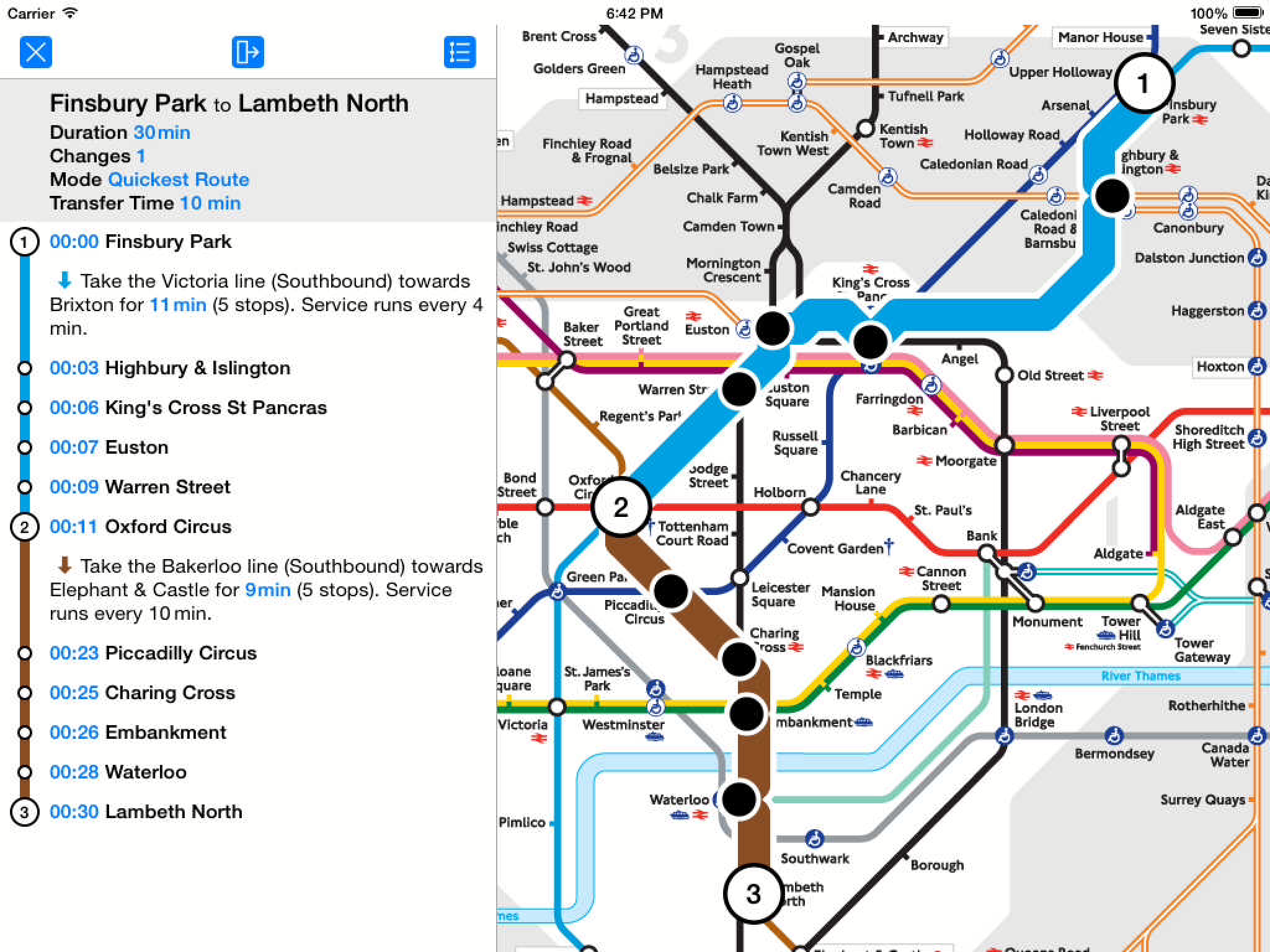
Typical App view with customised travel information by Visual IT Ltd.
So you see, a single color can represent something in a drawing. What about shape and details? Then we reach the realm of architecture and engineering, where models, scale and level of detail are discussed.
Next is an interview with Peter Koorstra about the use of scale in architectural models.

Image|Ability - Visualising the unimaginable by TU Delft OpenCourseWare is licensed under a Creative Commons Attribution-NonCommercial-ShareAlike 4.0 International License.
Based on a work at https://ocw.tudelft.nl/courses/image-ability-visualizing-unimaginable/.