


2.2.1 Measuring income inequality with the Gini index
Course subject(s)
2. The Vicious Circle of Segregation
If you paid attention to the first module’s material, you probably heard the Gini index mentioned a few times. In the context of this course, it is a fairly important term. So, what is it exactly?
There are different ways to measure inequality, for example, by focusing on the distribution of income or wealth. The most commonly used measurement of inequality is the Gini index (also called Gini coefficient or Gini ratio). It is the ratio of income distribution within a country or city, where 0 represents perfect equality with no income differences between individuals, and 100 represents perfect inequality with one person earning all the income. Of course, these extremes are never reached in a society, but there is large variation between countries in the Gini index. According to the most recent World Bank data, the Gini index ranges between 25 and 63 worldwide (sometimes also referred to as 0.25 and 0.63).
The Lorenz curve is a graphical representation of inequality. It is the curve that shows the actual distribution of income. This curve illustrates the proportion of income earned by a given percentage of the population. In the figure below, the horizontal axis shows the cumulative percentage of population ranked from the poorest to the richest, and the vertical axis shows the cumulative percentage of total income. The greater the distance between perfect equality (or the 45° line) and the observed distribution (or Lorenz curve), the more inequality there is in society. For example, perfect equality is when everyone gets the same salary – when 50% of the population gain 50% of the nations’ total income. In the figure below, the “very unequal distribution” indicates that the poorest 50% of the population earns 10% of the total income, and that the richest 5% earns 90% of the total income.
The Gini index is related to the Lorenz curve: Gini is calculated as the ratio of the area between the two curves (45° line and the curve of the observed distribution) to the whole area under the 45° line. In the figure, it is equal to A/(A+B). In the context of this course there is no need for you to understand the detail of how the Gini is calculated, but it is important that you are able to interpret the figure.
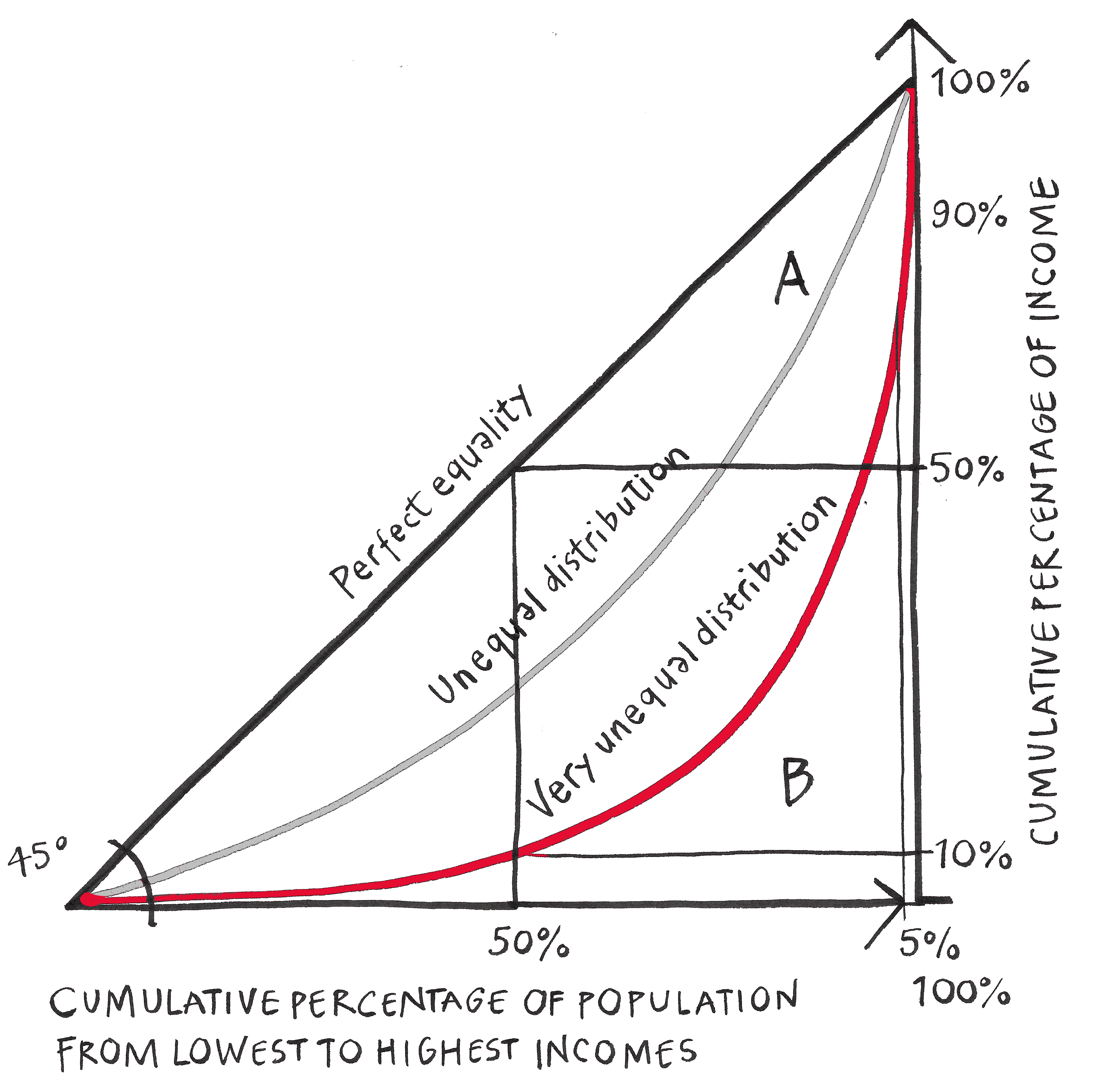
Illustration by G. Sanders, CC BY-NC-ND 4.0

Building Inclusive Cities: Tackling Urban Inequality and Segregation by TU Delft OpenCourseWare is licensed under a Creative Commons Attribution-NonCommercial-ShareAlike 4.0 International License.
Based on a work at https://online-learning.tudelft.nl/courses/building-inclusive-cities-tackling-urban-inequality-and-segregation/