5.5.1 Presentation slides: 6 tips to create the ultimate presentation
Course subject(s)
5. Build your blended course
6 tips to create the ultimate presentation
Slides can be used for presentations, lectures, but also as a basis for a video (screen recording). However, slides should be designed carefully so it will not hinder learning.
On July 1, 2020 there was a webinar on multimedia learning. During this webinar some tips and trick where shared to create the ultimate presentation slides for learning. Watch the webinar (from 1:20 till 26:02) or check the most important tips bellow.
6 tips:
-
-
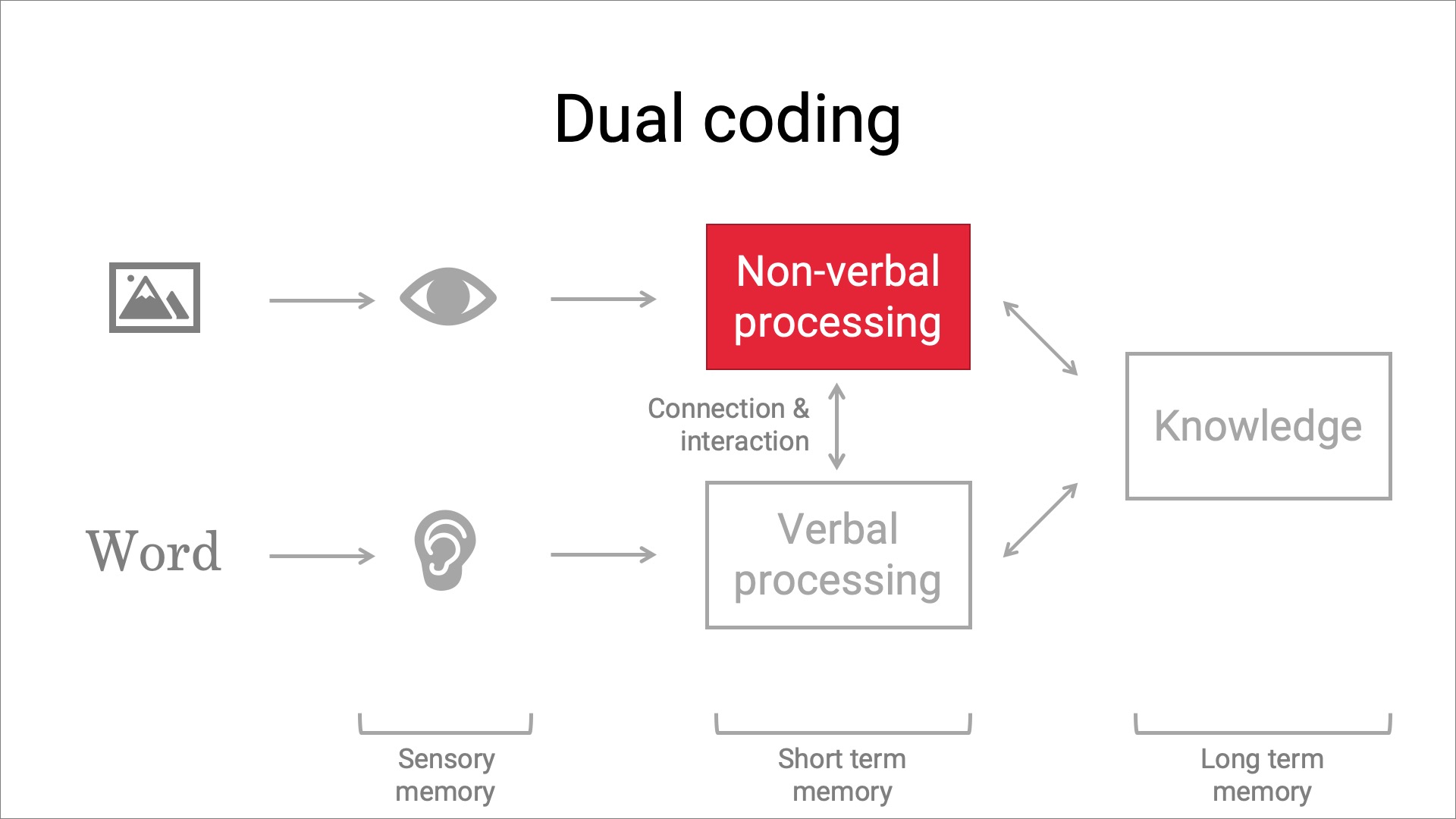
- Combine images and spoken words
- Less = more
-

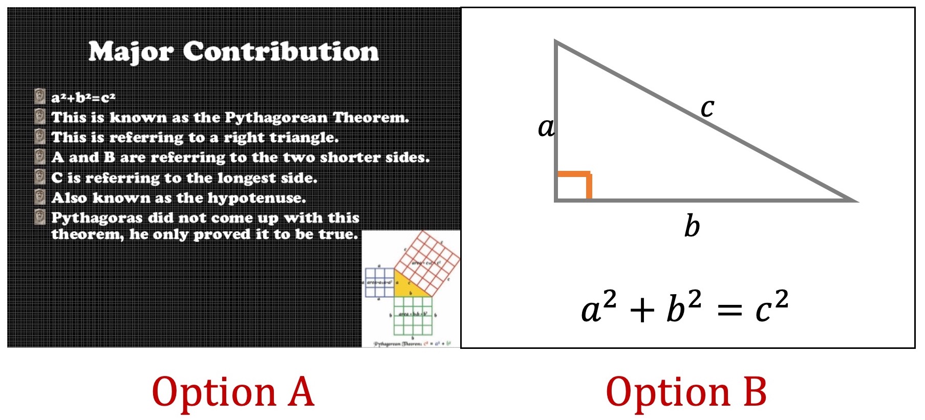
Which option do you think is better suited for a slide?
-
-
- Don’t put text on your slides (only keywords; slides are not a replacement for a reader or text book)
- Use images, icons, keywords, graphs, scheme’s to convey your ideas.
- Guide your learners attention: Highlight, use colors, remove unnecessary elements.
-

An example of a slide on how to guide your learners attention; use colors
-
-
- Provide a clear structure in your slide deck: Use an agenda, use splash screens for new topics (see below), and summarize each topic.
-

The purple screen on the left is an example of a splash screen. A splash screen is a bright and colorful slide to indicate a new topic is coming up. Its a visual cue for your learners.

Blending your Education by TU Delft OpenCourseWare is licensed under a Creative Commons Attribution-ShareAlike 4.0 International License.
Based on a work at https://digitelpro.eadtu.eu/course-programmes/blended-education/


